Introduction
This article aims at guiding you through the analisys process of a mockup found over the internet and shows you how to break down this mockup in order to create the Page(s), Frame(s) and View Component(s) templates.
With the "mockup" word we mean every HTML page saved from the Web browser as far as an entire Web template downloaded from specific websites.
Take as example the "GoFlexible" mockup. Download and save it.
After this operation you have a ".zip" file on your file system in which are contained all the resources you are going to use in order to create the Style Project.
The Style Project
Let's start creating the Style Project.
Choose File -> New -> Style Project from the main menu and type "GoFlexible" as the name for the project.
Now add all the files required by the mockup to the Style Project.
In the ".zip" file of the mockup you have a "css" and an "img" folder. Copy the whole folder "img" under the "GoFlexible" folder of the Style Project and copy the "style.css" file under the "GoFlexible/css" folder of the Style Project.
For the "style.css" file you also have to declare a resource in the "Layout.xml" manager.
Open the "Layout.xml" manager from the Style Project outline and select the Resources View. Press the "Add…" button to declare a new resource.

From the opened dialog browse the Style Project folder to find the "style.css" stylesheet; select it and then give it a name following the convention adopted by WebRatio ("StyleProjectName-FileName-FileType"), then press on OK to confirm.
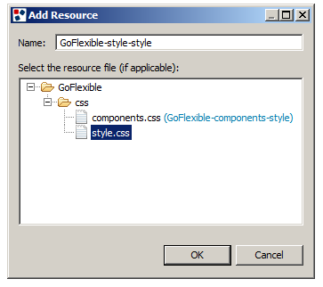
This resource must be declared as "Always Required" since it’s fundamental for the style. To do it press on the "Add…" button and select the resource from the dropdown, then press on OK to confirm.

Now you have to break down the layout. First of all look carefully at the layout and search for the main elements, in order to have a clear idea of what the final result should look like.

The image above highlights the main elements of this layout:
- Company logo.
- Company banner or custom image.
- First level menu.
- Page title.
- Second level and third level menu.
- Current third level menu.
- View Component (Cell) title.
- Frame.
The Default Page Layout
The main template of a Style Project is the Page Template. Let's see now how to create a new Page Template and how to set it as the Default one.
From the main menu choose File -> New -> Layout Template, select Page as the template type and press on "Next".
Select the "GoFlexible" Style Project, write the name for the template (which will be "Default") and press on the "Finish" button.
You will see some lines of code automatically generated by WebRatio.
Open the "Layout.xm"l file of the Style Project and open the General tab.
For the "Page Layout" property choose the "GoFlexible/Default" Page Template. Save the changes and then close the "Layout.xml" file.
To initialize the Page Template open with a text editor the "index.html" file contained in the ".zip" archive.
Part of the static content will be replaced with the code automatically generated by WebRatio.
Let's start copying the "DOCTYPE" declaration and substitute it to the declaration of line 3 of the Page Template; do the same also with the "xmlns" attribute of the HTML element that must be appended to the same element in the template.
Finally copy the code contained in between the <body> tag and paste it inside the <wr:PageForm> tag of the Page template, just before the <wr:Grid/> tag.
Considering the HTML structure let's adjust the code in order to apply to any Web Project disregarding its content and structure.
The Logo and the banner
The first part of the page to be analyzed is the header in which there are both the company logo and the banner.
This is the related HTML fragment.
<div id="header-section">
    <a href="#">
        <img id="header-background-left" src="./img/img_logo.jpg" alt=""/>
    </a>
    <img id="header-background-right" src="./img/img_header.jpg" alt=""/>
</div>
Change the "src" attribute of both images in order to retrieve the images (or one of your choice) from the folder (for instance "GoFlexible/img") included in the Style Project.
In the mockup the logo redirects the users to the Home Page so the "href" attribute must point to the URL of the Home page of the Web Project.
First of all it's necessary to retrieve the Home Page element of the Web Project, this element will be used in a WR tag that sets the correct link for it.
This is the code snippet:
[% def homePage = getHomePage(page.selectSingleNode("ancestor::SiteView")) %]
<a href="<wr:URL context="homePage"/>">
    <img id="header-background-left" src="GoFlexible/img/img_logo.jpg" alt=""/>
</a>
Also the Home Page name will be shown in the "alt" attribute.
<img id="header-background-left" src="GoFlexible/img/img_logo.jpg" alt="<wr:Label context="homePage"/>"/>
For the banner it's possible to let the user decide the "alt" message through a Layout Parameter.
<wr:LayoutParameter name="banner-alt-text" label="Banner Alt Text" type="string" default="Example Text">
    This is the text proposed in the alt attribute of the banner image.
</wr:LayoutParameter>
[% def bannerText = params["banner-alt-text"] %]>
To directly print the message:
<img id="header-background-right" src="GoFlexible/img/img_header.jpg" alt="[%= bannerText %]"/>
If you want a localized message, then you can use the message key:
<img id="header-background-right" src="GoFlexible/img/img_header.jpg" alt="<bean:message key="[%printJSPTagValue(bannerText)%]"/>"/>
The main menu
Let's now see how to manage the first level menu code. The template defines it as it follows:
<div id="header">
    <ul>
        <li><a href="#">Home</a></li>
        <li><a href="#">Menu Link 1</a></li>
        <li><a href="#">Menu Link 2</a></li>
        <li class="selected">Menu Link 3</li>
        <li><a href="#">Menu Link 4</a></li>
        <li><a href="#">Menu Link 5</a></li>
    </ul>
</div>
There's a <li> element for each landmark element which is directly child of the Site View. Note that a landmark element can be an Area, a Page or an Action, so let's choose the WR tag which allows to retrieve landmark elements disregarding their type (<wr:LandmarkMenu>).
To specify that the tag must search only the "first level" landmarks, set the "level" attribute to 1.
Moreover, to apply the "selected" class to the current selected link, let's use the <wr:Current> and <wr:NonCurrent> tags.
Finally use the <wr:Link/> tag to generate directly the HTML anchor for the link.
This is the final result:
<div id="header">
    <ul>
        <wr:LandmarkMenu level="1">
            <wr:Current>
                <li class="selected"><wr:Label/></li>
            </wr:Current>
            <wr:NonCurrent>
                <li><wr:Link/></a></li>
            </wr:NonCurrent>
        </wr:LandmarkMenu>
    </ul>
</div>
If in your Project the Home is also a landmark you may not want to print the Home Page link another time.
To do it, wrap the content of the <wr:LandmarkMenu> tag with this Groovy conditional fragment:
<wr:LandmarkMenu level="1" var="link">
    [% if(link != homePage){ %]
        ....
    [% } %]
</wr:LandmarkMenu>
The other menu
The same approach can be used to create the code for the second and third level menu. This is the mockup definition:
<div id="left-column">
    <ul>
        <li class="left-navheader-first">Menu 3</li>
        <li><a class="left-navheader" href="#">Menu link 3-1</a></li>
        <li><a href="#">Menu Link 3-1-1</a></li>
        <li><a href="#">Menu Link 3-1-2</a></li>
        <li><a href="#">Menu Link 3-1-3</a></li>
        <li><a class="left-navheader" href="#">Menu Link 3-2</a></li>
        <li><a href="#">Menu Link 3-2-1</a></li>
        <li><a href="#">Menu Link 3-2-2</a></li>
        <li><a href="#">Menu Link 3-2-3</a></li>
        <li><a class="left-navheader" href="#">Menu Link 3-3</a></li>
        <li><a href="#">Menu Link 3-3-1</a></li>
        <li class="selected">Menu Link 3-3-2</li>
        <li><a href="#">Menu Link 3-3-3</a></li>
        <li><a class="left-navheader" href="#">Menu Link 3-4</a></li>
        <li><a href="#">Menu Link 3-4-1</a></li>
        <li><a href="#">Menu Link 3-4-2</a></li>
        <li><a href="#">Menu Link 3-4-3</a></li>
    </ul>
</div>
The first <li> element is the page title. We will generate it using the <wr:Label/> tag with context "page".
<li class="left-navheader-first"><wr:Label context="page"/></li>
The second <li> element is the one that has to be shown for each second level menu entry. Let's use the same tag seen before, just change the "level" attribute and set it to 2.
<div id="left-column">
    <ul>
        <li class="left-navheader-first"><wr:Label context="page"/></li>
        <wr:LandmarkMenu level="2">
            <li><wr:Link/></li>
        </wr:LandmarkMenu>
    </ul>
</div>
Let's proceed with the necessary code to print the third level menu.
<div id="left-column">
    <ul>
        <li class="left-navheader-first"><wr:Label context=”page”/></li>
        <wr:LandmarkMenu level="2">
            <li><wr:Link/></li>
            <wr:LandmarkMenu level="3">
                <li><wr:Link/></li>
            </wr:LandmarkMenu>
        </wr:LandmarkMenu>
    </ul>
</div>
This code prints the third level menu only for the current second level menu element and not for the others. The original template does not make this distinction and prints it always. In order to do this it's necessary to manage both the current and not current element.
<div id="left-column">
    <ul>
        <li class="left-navheader-first"><wr:Label context="page"/></li>
        <wr:LandmarkMenu level="2">
            <wr:Current>
                <li><wr:Link/></li>
                <wr:LandmarkMenu level="3">
                    <li><wr:Link/></li>
                </wr:LandmarkMenu>
            </wr:Current>
            <wr:NonCurrent>
                <li><wr:Link/></li>
                <wr:LandmarkMenu level="3">
                    <li><wr:Link/></li>
                </wr:LandmarkMenu>
            </wr:NonCurrent>
        </wr:LandmarkMenu>
    </ul>
</div>
Let's replace the third level menu with this code to distinguish between current and not current third level menu element:
<wr:LandmarkMenu level="3">
    <wr:Current>
        <li class="selected"><wr:Label/></li>
    </wr:Current>
    <wr:NonCurrent>
        <li><wr:Link/></a></li>
    </wr:NonCurrent>
</wr:LandmarkMenu>
The page content
The Page Template is almost finished. Let's consider now the central and the right column. In the central column there are all the page contents, which correspond to the Grid contents of a IFML Model's Page. In the right column there is other content, which cannot be taken from the grid; it must be placed in some other locations; the so called Custom Locations. The last step, so, is to delete from the template the content of both columns; write the <wr:Grid/> tag in the central column and the <wr:CustomLocation/> tag in the other one. This is the result of the operation:
<div id="right-column">
    <wr:CustomLocation name="right-column"/>
</div>
<div id="middle-column">
    <wr:Grid/>
</div>
The Page Template is now completed and it works with every modeled page.
The Default Frame Layout
Let's now see how to create the frame for View Components and Cells.
Choose File -> New -> Layout Template from the main menu, choose "Frame" as the template type and press on "Next".
Now choose the "GoFlexible" Style Project, type "Default" for the template name and press on the "Finish" button.
Open the "Layout.xml" file of the Style Project, choose the General tab and select for the "Frame Layout" property the "GoFlexible/Default" frame template.
Save the changes and close the "Layout.xml" file.
Copy the following code fragment in the template:
<div class="middle-column-box-title-grey">Grey title</div>
Substitute the "Grey title" string with the <wr:Label context="element"/> tag and add the <wr:FrameContent/> tag at the end of the code:
<div class="middle-column-box-title-grey">
    <wr:Label context="element"/>
</div>
<wr:FrameContent/>
Inside the "style.css" file there are different classes for frame colors that can be applied.
In order to add the chance to the user to choose the color, let's add a parameter to the frame.
<wr:LayoutParameter name="color" label="Frame Color" type="enum" values="grey|blue|yellow|green|red" default="grey"/>
[%    setHTMLOutput()
    def color = params["color"]    %]
<div class="middle-column-box-title-[%=color%]">
    <wr:Label context="element"/>
</div>
<wr:FrameContent/>
The Right Column Frame
Now let’s see how to create the frame for View Components and Cells.
Choose File -> New -> Layout Template from the main menu, choose "Frame" as the template type and press on "Next".
Now choose the "GoFlexible" Style Project, type "RightColumn" for the template name and press on the "Finish" button.
Copy the following code fragment in the template:
<div class="right-column-box-white">
    <div class="right-column-box-title-grey">Color options</div>
    <p>All boxes in the middle and right columns can vary colors for titles and backgrounds. See examples below. The colors for titles and backgrounds can be chosen independently.</p>
</div>
Substitute the "Color options" string with the <wr:Label context="element"/> tag and the <p> paragraph with the <wr:FrameContent/> tag:
<div class="right-column-box-white">
    <div class="right-column-box-title-grey">
        <wr:Label context="element"/>
    </div>
    <wr:FrameContent/>
</div>
You can apply the same pattern for color management of the Default Frame:
<wr:LayoutParameter name="color" label="Frame Color" type="enum" values="grey|blue|yellow|green|red" default="blue"/>
<wr:LayoutParameter name="bgcolor" label="Frame Background Color" type="enum" values="white|blue|yellow|green|red" default="grey"/>
[%    setHTMLOutput()
def color = params["color"]
def bgcolor = params["bgcolor"]    %]
<div class="right-column-box-[%= color %]">
    <div class="right-column-box-title-[%= bgcolor %]">
        <wr:Label context="element"/>
    </div>
    <wr:FrameContent/>
</div>
The Default Grid template
Looking to the mockup structure it's also possible to create a Grid Template.
Choose File -> New -> Layout Template from the main menu and "Grid" as the template type, then press on "Next".
Now choose the "GoFlexible" Style Project, type "Default" for the template name and press on the "Finish" button.
Open the "Layout.xml" file of the Style Project, choose the General tab and select for the "Grid Layout" property the "GoFlexible/Default" Grid Template.
Save the changes and close the "Layout.xml" file.
The Grid Layout will be based on the "WRDefault" definition since this template takes into account all the operations that a WebRatio user can do on the Grid, such as merging cells.
Open the "WRDefault/Default" Grid Template and copy all the code. Paste the code in the "GoFlexible/Default" Grid Template.
Since the Grid of the mockup is based on <div> elements, it's not possible to consider some cell's information that the user can specify in the Properties View, such as "align" and "spacing".
So you can simplify the template deleting the following lines of code:
1.
<wr:LayoutParameter label="Width" name="width">
Defines the width of the cell of the grid.
</wr:LayoutParameter>
2.
def paramGridWidth = params["width"]
def gridWidth= grid.attributeValue("width", paramGridWidth)
def gridHeight=grid["height"]
def gridCSSStyle=grid["cssStyle"]
def gridAlign=grid["align"]
def cellpadding=grid["padding"]
def cellspacing=grid["spacing"]
Take a look at the following code fragment in the template at the end of the template. This is the main content structure definition:
<div class="middle-column-box-white">
    <div class="middle-column-box-title-grey">Grey title</div>
    <p>
        <img src="./img/img_general.jpg" class="middle-column-img-left" width="100" alt="" />
        Lorem ipsum dolor sit amet, consectetuer adipiscing elit. <a href="#">Aliquam at libero</a>.
        Suspendisse non risus a diam convallis lobortis. Lorem ipsum dolor sit amet, consectetuer adipiscing elit.
        Suspendisse non risus a diam convallis lobortis. Lorem ipsum dolor sit amet, consectetuer adipiscing elit.
        Suspendisse non risus a diam convallis lobortis.
    </p>
    <p>
        <a href="#">Read more</a>
    </p>
</div>
<div class="middle-column-left">
    <div class="middle-column-box-left-white">
        <div class="middle-column-box-title-grey">Grey title</div>
        <p>
            <img src="./img/img_general.jpg" class="middle-column-img-left" width="50"  alt="" />
            Lorem ipsum dolor sit amet, consectetuer adipiscing elit. <a href="#">Aliquam at libero</a>.
            Suspendisse non risus a diam convallis lobortis.
        </p>
        <p><a href="#">Read more</a></p>
    </div>
    <div class="middle-column-box-left-white">
        <div class="middle-column-box-title-grey">Grey title</div>
        <p>
            Lorem ipsum dolor sit amet, consectetuer adipiscing elit. <a href="#">Aliquam at libero</a>.
            Suspendisse non risus a diam convallis lobortis.
        </p>
        <p><a href="#">Read more</a></p>
    </div>
</div>
<div class="middle-column-right">
    <div class="middle-column-box-right-white">
        <div class="middle-column-box-title-grey">Grey title</div>
        <p>
            Lorem ipsum dolor sit amet, consectetuer adipiscing elit. <a href="#">Aliquam at libero</a>.
            Suspendisse non risus a diam convallis lobortis.
        </p>
    </div>
    <div class="middle-column-box-right-white">
        <div class="middle-column-box-title-grey">Grey title</div>
        <p>
            <img src="./img/img_general.jpg" class="middle-column-img-left" width="50"  alt=""/>
            Lorem ipsum dolor sit amet, consectetuer adipiscing elit. <a href="#">Aliquam at libero</a>.
            Suspendisse non risus a diam convallis lobortis. Suspendisse non risus a diam convallis lobortis.
            Suspendisse non risus a diam convallis lobortis
        </p>
    </div>
</div>
Let's adapt the template to this example, starting to delete the <table> element from it.
First of all you have to rearrange the code in order to calculate if a row contains one or two (or more) cells. This is necessary because in the first case the template has to print the "middle-column-box-white" <div> and its content; in the other case it has to print the "middle-column-left" <div> for the first cell and the "middle-column-right" <div> for the second cell.
This is the final result:
[%  for (row in gridRows){
    def containedCells = row.selectNodes("layout:Cell").findAll{!hiddenCells.contains(it)}
    def cellsCount = containedCells.size()
    if (cellsCount == 1){      %]
    <div class="middle-column-box-white">
        <wr:Cell context="containedCells[0]"/>
    </div>
    [%    } else{    %]
    <div class="middle-column-left">
        <div class="middle-column-box-left-white">
            [% if (true){ %]<wr:Cell context="containedCells[0]"/>[% } %]
        </div>
    </div>
    <div class="middle-column-right">
        <div class="middle-column-box-right-white">
            [% if (true){ %]<wr:Cell context="containedCells[1]"/>[% } %]
        </div>
    </div>
    [%    }
}    %]
Note that the code above implies that the Grid for this template has at most two cells for each row. It's not possible to avoid that the IFML Page has more than two columns to a row, but these cells will be ignored by the template. It's possible to alert the user that some columns will be ignored.
Add the following method at the top of the template:
[%    def throwGenerationException(message){
    throw new com.webratio.generator.GenerationException(null,message,[],null)
} %]
Add the call to the method just after the "cellsCount" variable definition. This code checks if the current row has more than two visible cells and generates an error with a custom message.
[%  for (row in gridRows){
    def containedCells = row.selectNodes("layout:Cell").findAll{!hiddenCells.contains(it)}
    def cellsCount = containedCells.size()
    if(cellsCount > 2){
        throwGenerationException("You can use at most two cells for each row")
    } else {
    if (cellsCount == 1){    %]
        <div class="middle-column-box-white">
            <wr:Cell context="containedCells[0]"/>
        </div>
    [%    } else{    %]
        <div class="middle-column-left">
            <div class="middle-column-box-left-white">
                [% if (true ){ %]<wr:Cell context="containedCells[0]"/>[% } %]
            </div>
        </div>
        <div class="middle-column-right">
            <div class="middle-column-box-right-white">
                [% if (true ){ %]<wr:Cell context="containedCells[1]"/>[% } %]
            </div>
        </div>
    [%    }
    }
}    %]
Final result
Below you find a screenshot of the "GoFlexible" style applied to the "Acme" Web Project available on WebRatio Add-on section.
